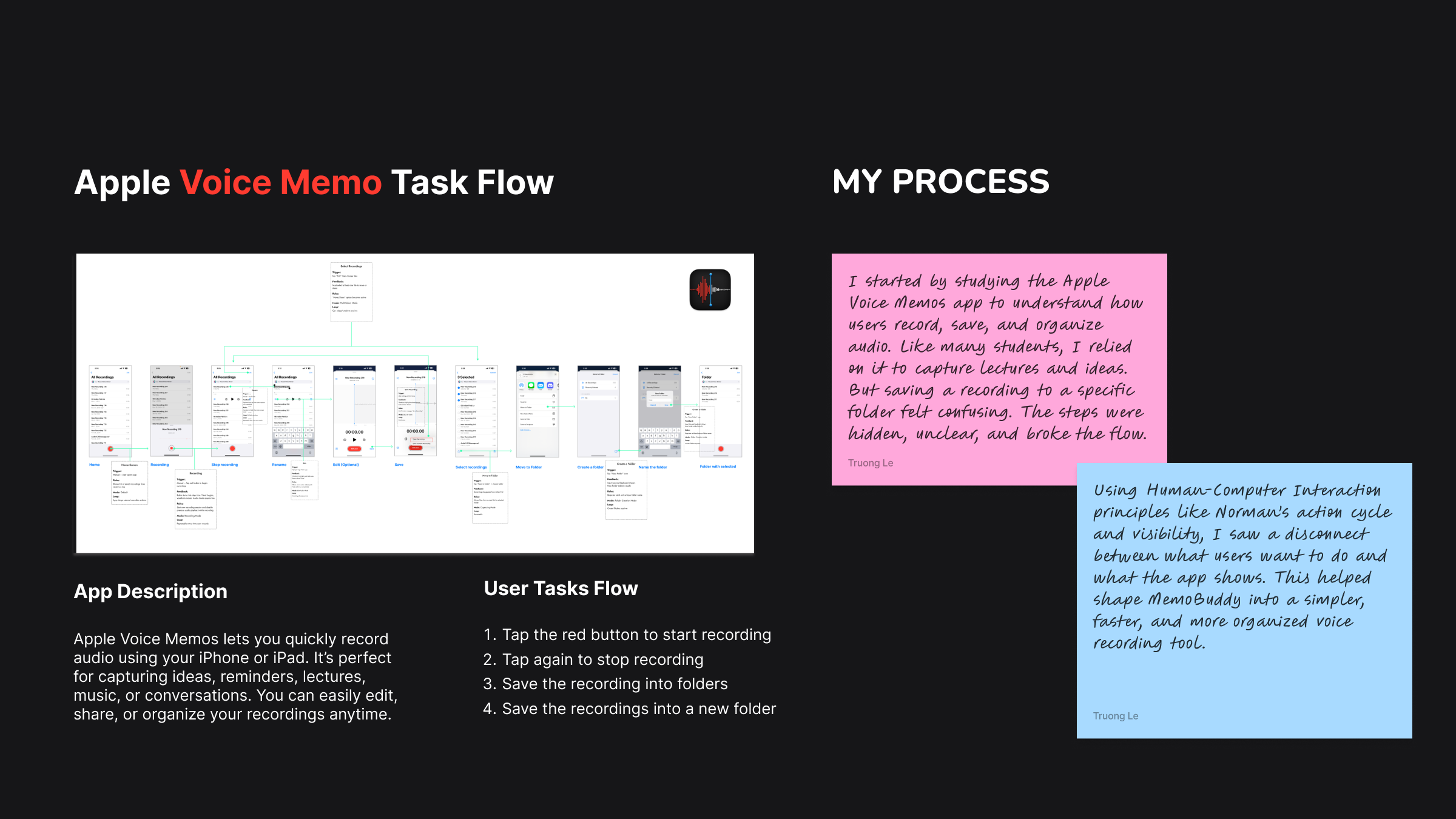
For Ensemble Arts, Truong translated the elegance of performing arts into a modern brand system inspired by the Academy of Music. He drew from the contrast of green chalkboards and pink roses to create a palette that feels both historic and fresh. To solve scattered fonts and layouts that diluted the brand, he built a unified typographic system where note stems guide text flow, oversized ligatures echo sweeping melodies, and a tight grid keeps details clear, turning the booklet into a visual score and the website into its digital extension.


.jpg)


-1-Cover%20%2B%20Image%20Right.png)
-2-Cover%20%2B%20Image%20Right%20(1).png)
-3-Cover%20%2B%20Image%20Right.png)
-4-Cover%20%2B%20Image%20Right.png)


-10-Cover%20%2B%20Image%20Right.png)
-11.png)
.png)


.png)


.png)

.png)


.png)